
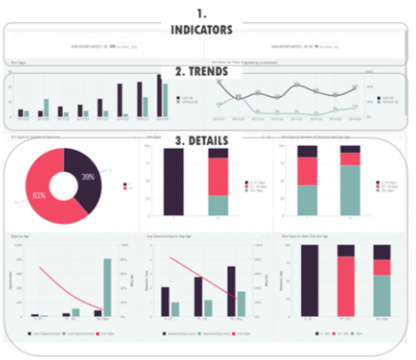
For the past few months, a small team within Information Services (IS) that I am a member of has been working on developing a business dashboard for the department. The dashboard will provide its users, in this case IS leadership and key stakeholders, with a simple, high-level view of valuable data and trends that display the status of the department, shed light on its performance compared to strategic goals, and reveal potential areas for improvement and growth. In fact, the term ‘dashboard’ originates from the automobile industry and is a metaphor for a car dashboard which allows drivers to monitor the status of a vehicle and its major functions at a glance, through a combination of visual gauges and displays.
To develop the IS dashboard, our team needs to first determine which metrics and key performance indicators (KPIs) to include and create a data model to collect this information on a regular basis. Even though we are still early in the development process, one element that appears to be particularly important is the visual design of the dashboard. According to experts, while the right dashboard can enhance visibility into the department, promote transparency, and raise awareness, a poorly designed one could make the data less comprehensible than it was originally, failing to convey meaningful insights. Since design is so crucial to the effectiveness of dashboards, I wanted to share some best practices that have come up in my research.
The five-second rule
A dashboard should provide relevant information on the most frequently asked business questions in about five seconds. If the viewer must peruse the information for minutes, this could indicate a problem with the dashboard’s visual layout. Of course, more detailed investigation for deep insights and comparisons could take longer, but the most important metrics should immediately pop from the screen.
The inverted pyramid
It is important to organize dashboard content in a logical way so that it tells a story. One useful organizing principle is the inverted pyramid, which originated from the world of journalism. In news reports, content is divided into three sections in order of diminishing significance. The most important and substantial information is at the top, followed by the significant details that add some context, and at the bottom there is more background that allows the reader to dive deeper. Think of the headline, subheading, and body of a news article.
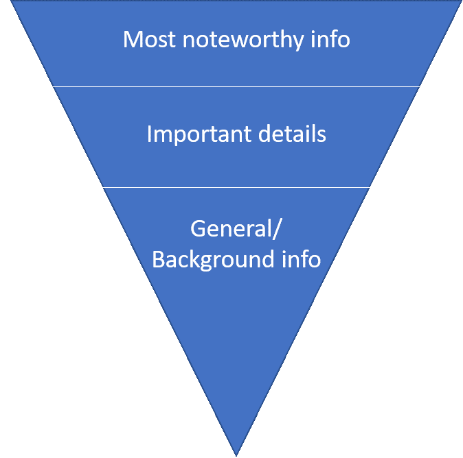
The story a business dashboard tells should follow the same internal logic. The most significant and high-level insights should be at the top, the trends, which give context to these insights, underneath them, and the granular details that can be further explored at the bottom.
Source: Ilan Hertz, Sisense
Less is more
Each dashboard should contain no more than five to nine visualizations. Cognitive psychology suggests that the human brain can only comprehend approximately seven, plus or minus two, images at one time. More than that translates into clutter and visual noise that distracts from the dashboard’s intended purpose. Clutter can be avoided by using filters and hierarchies. For example, instead of displaying one indicator for number of sales in North America and one for South America, a filter could allow the user to switch the same indicator between one and the other. Another option would be to simply break the dashboard into two or more separate dashboards.
Using appropriate data visualizations
Data visualizations on a dashboard should serve a specific purpose, conveying information in a more effective way than the basic table or grid format. Graphs and charts are intended to be more than a mere cool factor. Depending on the nature of the relayed information, different visualizations may be appropriate.
To convey a relationship, a connection between two or more variables, scatter charts, bubble charts, or network diagrams are the most appropriate.
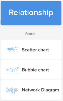
Source: Taras Bakusevych, UX Planet
Column and line charts can be used to compare two or more variables side by side. Helpful tips: When a horizontal or vertical bar chart is used, columns should be sorted by biggest value. Line graphs should not contain more than five lines, and bar charts not more than seven bars.
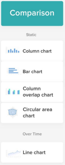
Source: Taras Bakusevych, UX Planet
For composition, breaking data into separate components, pie and donut charts are best. However, they can be quite difficult to read when there are too many components or very similar values. It is hard for humans to differentiate values when it comes to angles and areas.
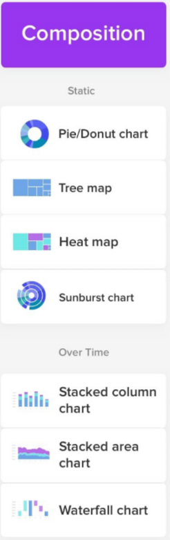
Source: Taras Bakusevych, UX Planet
Distribution charts, like scatter plots and histograms, are very helpful in illustrating outliers, groupings, and the range of values within data.
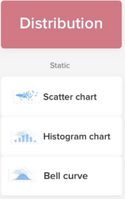
Source: Taras Bakusevych, UX Planet
I find these design principles and visualization best practices to be applicable across settings, and I hope that some of them will prove valuable to your department, if you are considering developing your own business dashboard.